Quick and Easy Design Theory Tips
Oftentimes you can create a snappy design that just doesn’t seem to work – it looks nice and all, but there’s something about it, something you just can’t quite put your finger on, that stalls it dead in it’s tracks. We’ll explore four areas that may just solve the problem … or at least help you get pointed in the right direction.
1. Contrast
If something has strong contrast, it means it stands out better from the page, or from other items on the page. In a nutshell, contrast works something like this:
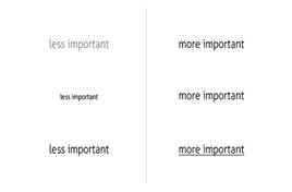
As you can see illustrated above, the most common way to increase contrast is through colour (black on white works better than light grey on white, for example), through size, or through other treatments. But it can also be done visually by reducing the number of items that compete for attention and putting the primary focus on the main stuff although this might apply a bit more to websites or ad pages that have many items, or where the ‘real estate’ is more valuable and more information is presented at one time.
It can also be applied to type treatments, the size of the item in question, and even something as small as line thicknesses.
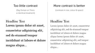
A good rule of thumb is that if they are not the same, make them markedly different.
However, there should always be a measure of consistency with what contrasts you use for certain areas on the page — simply, don’t jumble up your contrasts to such an extreme that some content is harder to read or it hurts your viewers’ eyes, and keep contrasts the same (or very similar) in given sections of a page.
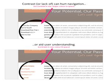
Contrast is key to differentiating among sections of your website, as illustrated:
2. Repetition
Repetition aids in the understanding of content (visual or written) through organization. Repeating these elements not only helps the viewer to understand their relationship to each other but also to the page as a whole (and subsequently understanding relative importance within the page) as well as its importance within the site. Knowing what importance to put on key areas helps the viewer organize the content in his mind.
Defining key elements through repetition makes the experience coherent and unified — whether the experience is browsing your website, reading a brochure or looking at a business card.
For example, if we were to style all copy on the page at the same font size and weight, we’d certainly have repetition but there would be no sense of importance on key areas. (see Contrast, above as well) We’ve learned to style redundant items like navigation, footers, etc., to be a certain size and weight and other areas to be ‘heavier,’ visually. This marked consistency in the former areas comforts the viewer by telling his brain that these items are unchanging and reliable (important for navigational elements) and the content can have his attention without needing to re-examine each page every time it loads. In this example, we use repetition to our benefit and it aids in navigation and understanding. It wouldn’t work that way if every single item looked the same. (unless, of course, our site, by design, needs to be this way — in which case we find other, more subtle ways to inform the viewer of primary and redundant areas) The greater the similarity between or among elements, (typically) the more gravity is given to subtleties, as shown below:
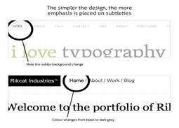
These subtleties would be lost on a busier, more graphically intense site but work well on these sites that are already a bit minimal to begin with. For example, on Amazon.com these subtleties in main navigation would be missed more often than not and that would result in a drop in sales volume and revenue for the company. Individual elements of good design, as illustrated, compliment itself as a whole.
Example
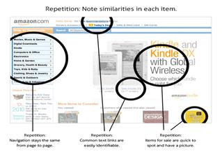
Notice how the Amazon index page breaks up information and content sections using good use repetition for each component or type of item:
3. Alignment
Each item or element on the page should not just be placed at random. This doesn’t mean that every single itemmust be aligned with every thing else, or even aligned with something else — but should contribute to the coherence of the whole. What you’re looking for is a visual connection between or among the elements on the page.
Alignment can help increase an item’s visual weight on the page, and therefore the importance the viewer puts on it.
This can be used to increase contrast as well — pull quotes are a great example of how bumping out of regular alignment can draw attention without throwing the user’s train of thought. By aligning more strictly most items on the page (or redundant items like navigation) and letting a main feature pop out of this alignment, we are contrasting that item with the others on the page, and thereby increase it’s visual weight and the importance the viewer puts on it.
Example
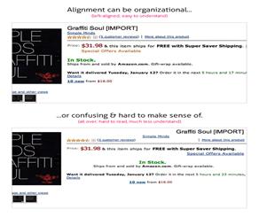
Take a look at how Amazon accomplishes this on their product info pages (I pulled up Simple Minds “Graffiti Soul” album):
4. Proximity
It goes without saying that if we have two related elements on a page (eg: a picture that accompanies an article) we want to keep it close by it’s article, and preferably close by the part of the article it relates to specifically.
Proximity is one of the key ways we determine relationships and organize information.
For example, some business cards have both a business name & number and a personal name & number. Nowhere on the card does it specifically say that the number under the business name applies to the person, and the number under the person is the generic business number. We know, by their proximity, that if we dial the first number we’ll reach the front desk and if we dial the second we’ll reach the person whose name is on the card.
Example
Take a look at Amazon.com again. Notice the bottom links and screen size information for the two Kindle models:
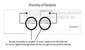
We wouldn’t think for a second that the screen sizes would apply to anything other than the Kindle models they are shown under, respectively. The power of proximity is one of suggestion. Without actually saying two pieces of information are connected, you are able to reduce visual clutter and present material more intuitively.
Items placed closer to the primary content on a site we know are related to the primary content or are at least of greater relational importance to that content. Relevancy is implied by the proximity of one item to another: We increase the likelihood of a relationship the closer these items become.
It’s Design Theory
It’s important to understand that these are principles of design theory — common sense, if you will. They aren’t hard and fast rules, and sometimes we can bend a principle a bit more on one project than we do on another. It’s all in the design at hand. That said, it’s really about common sense although sometimes having a good eye for this type of stuff can make a big difference.
These four principles are a good starting point to break down any design and see if it needs to be tweaked or worked with a bit. And it’s easy to remember (work out the acronym for yourself: D)
Here they are again, simply:
· Contrast
· Repetition
· Alignment
· Proximity
Ex. 2. Practice & Have Fun. With each of these four principles in mind, grab a small notebook and spot areas in common visual designs that can be tweaked or worked with – whether they’re your projects or not – and write down ways they can be improved. After a little while, it’ll be like second nature looking at things this way and you’ll also notice an upgrade in your own design work.
